Problem
In Aotearoa New Zealand, most eligible voters don't take
part in local elections, driving low voter turnout. The process is also overly complex and varies from
city to city — confusing for anyone who's moved.
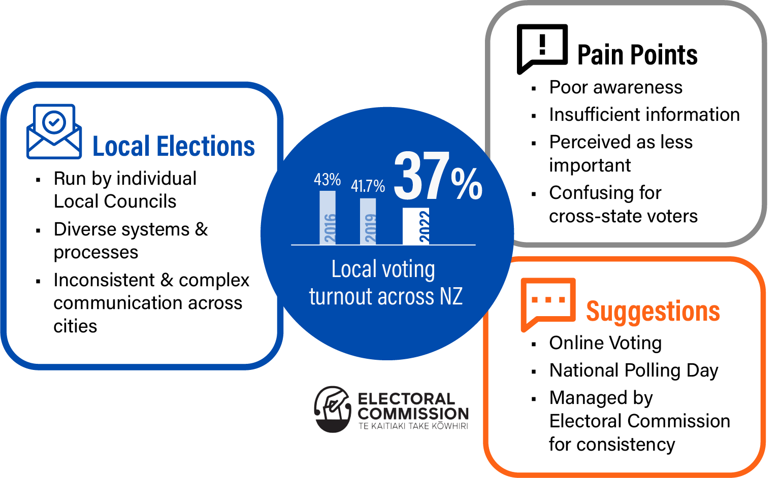
This 5-member group project set out to fix confusing, inconsistent communication around local voting. The result unifies branding and simplifies voting information across every channel, physical and digital.
Type Academic, User Experience
Strategy
Brand NZ Electoral Commission
Role Project Management, Strategist, brand guide, poster
co-designer
Skills Photoshop, Illustrator, Figma, Miro,
Canva, Research, Affinity mapping, Brand guide
Problem
In Aotearoa New Zealand, most eligible voters don't take
part in local elections, driving low voter turnout. The process is also overly complex and varies from
city to city — confusing for anyone who's moved.
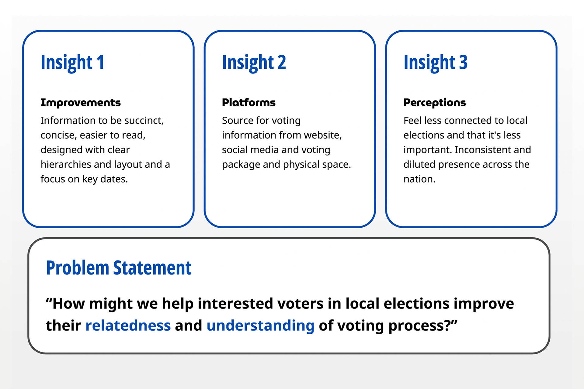
Research & Insights
Semi-structured interviews with Wellington voters
surfaced a clear need: clearer, more accessible information and a stronger sense of connection to the
election.
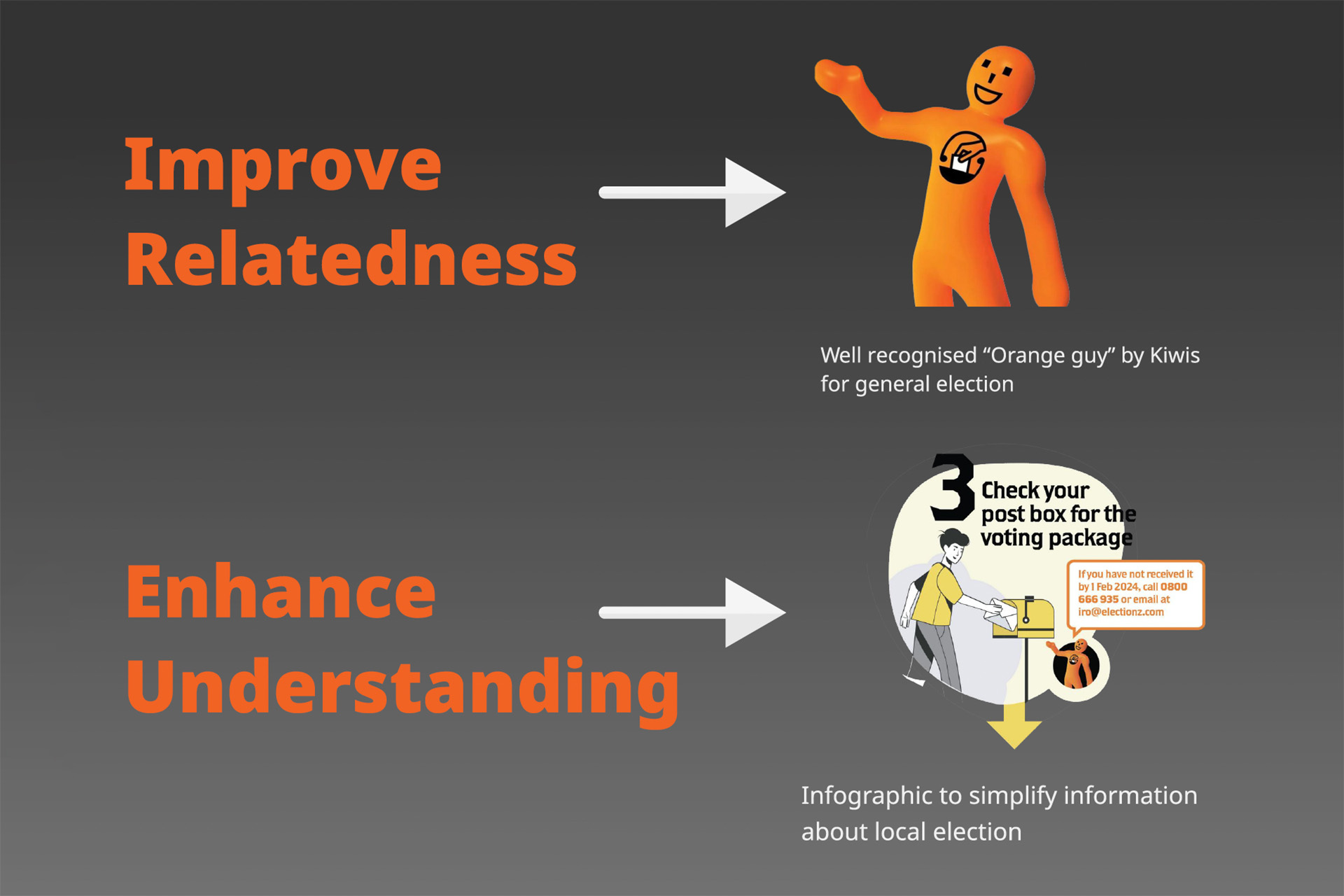
Concept
We introduced the "Orange Guy," a figure widely recognised from
general elections, to build familiarity with local voting.
Simplified messaging and clear infographics made the process easier to understand and more
engaging.
Usability Test
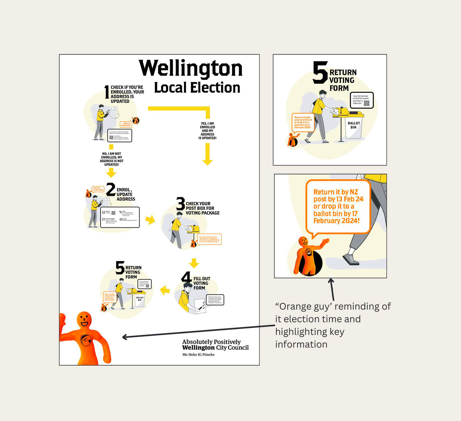
We tested a prototype
infographic using the "Orange Guy" to highlight key election information. Participants were asked to
find:
We then gathered feedback on how easily they found the information, their thoughts on the design, and their reaction to the "Orange Guy."
Usability Test Insights
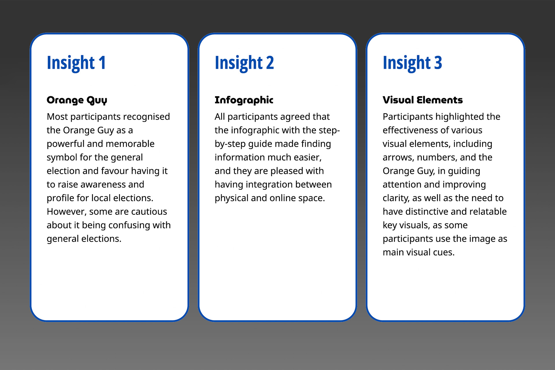
Participants responded well to the "Orange Guy," the
simplified infographics, and key visual elements — all found to improve clarity and boost
engagement.
Strategy
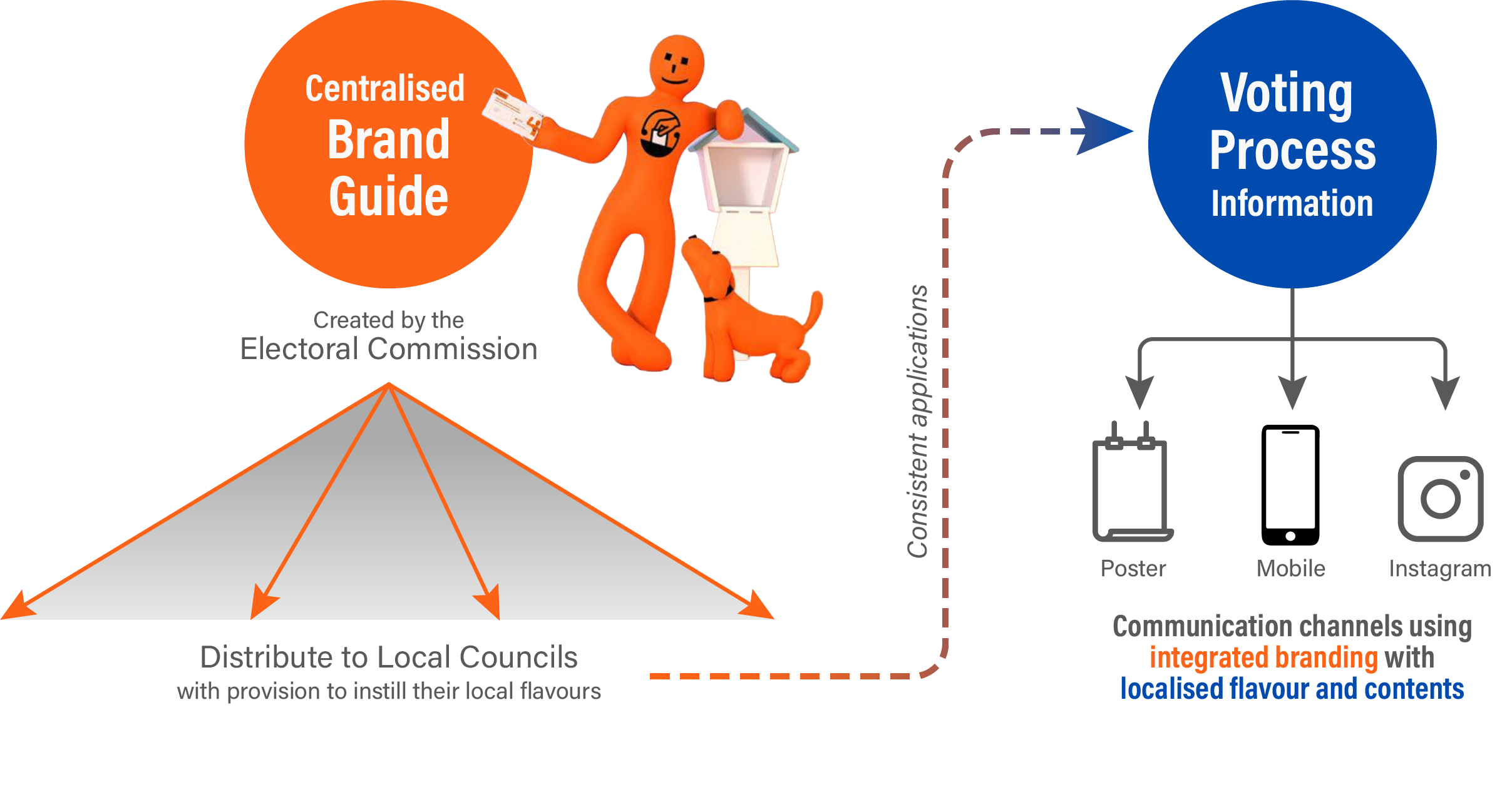
We proposed a centralised, adaptable brand system for local
election zones — one that keeps messaging consistent while emphasising the importance of local
elections. It's brought to life through simplified infographics and refined collateral across physical
and digital platforms.
Bringing the "Orange Guy" into local elections leverages its strong association with voting in New
Zealand, while clear infographics make complex information easy to grasp.
User
Flow
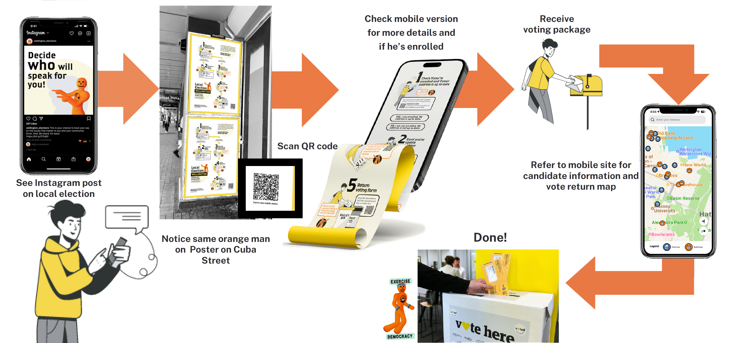
The user flow maps every touchpoint — from physical posters and digital
platforms through to completing the vote.
Brand
Guide
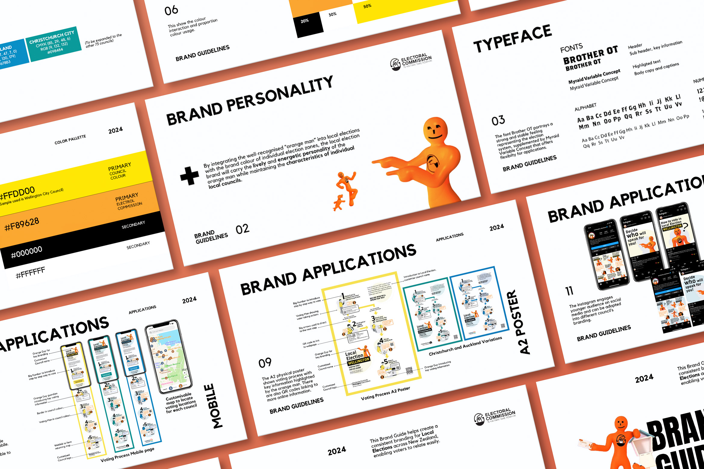
The brand guide lets local councils adopt and customise the system to
reflect their own style, helping voters feel more connected to elections in their area.
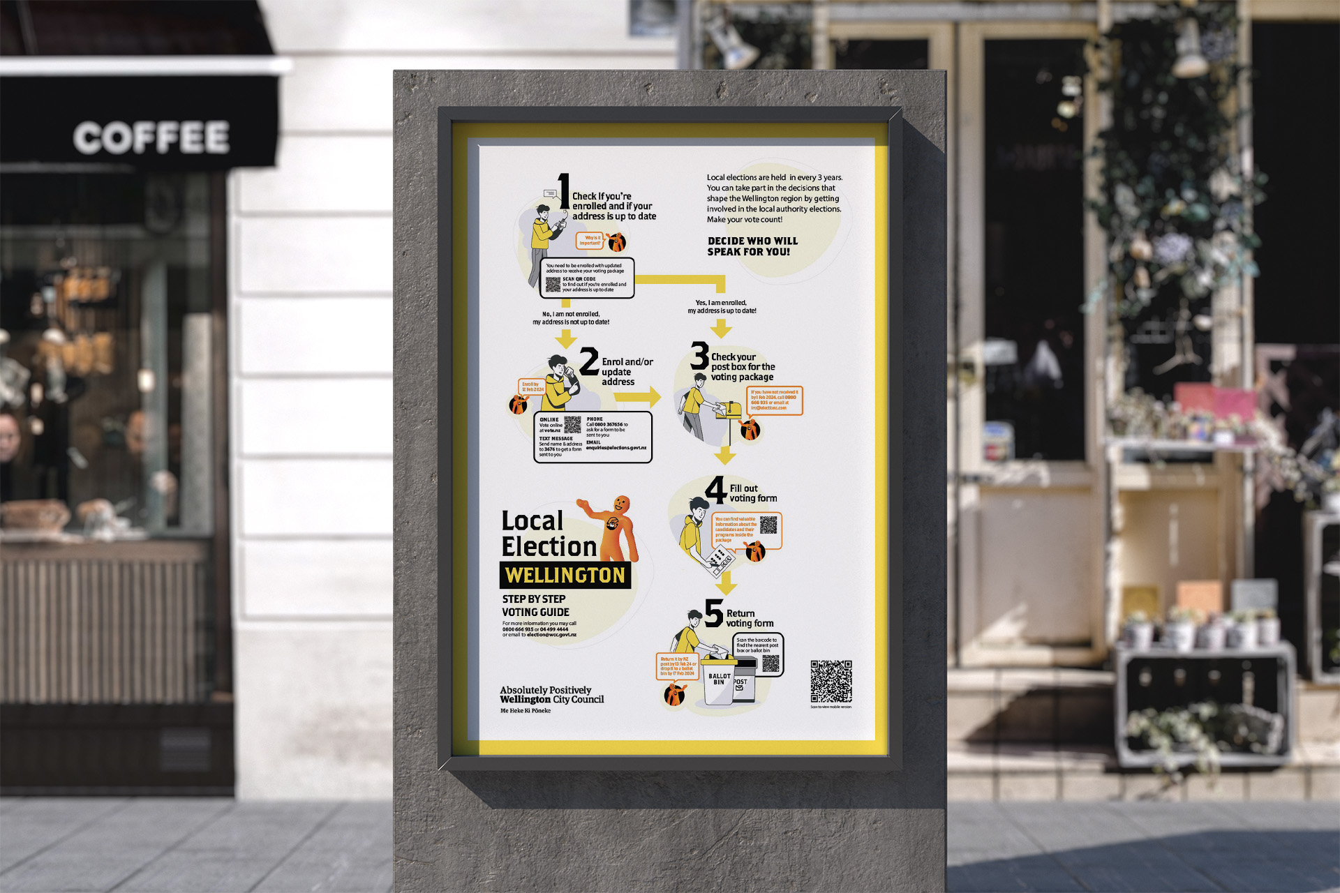
Poster
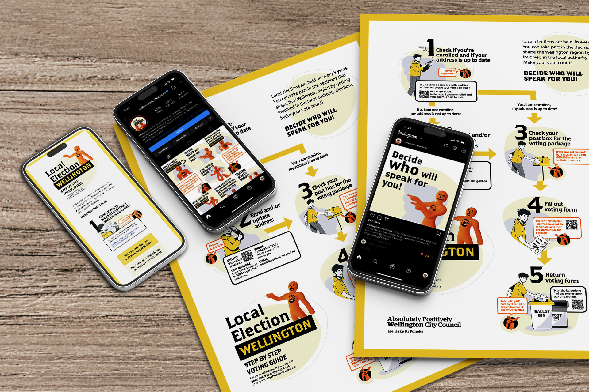
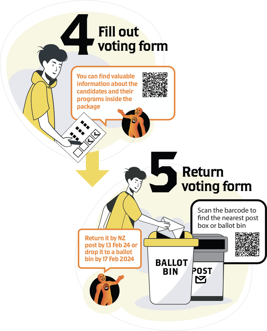
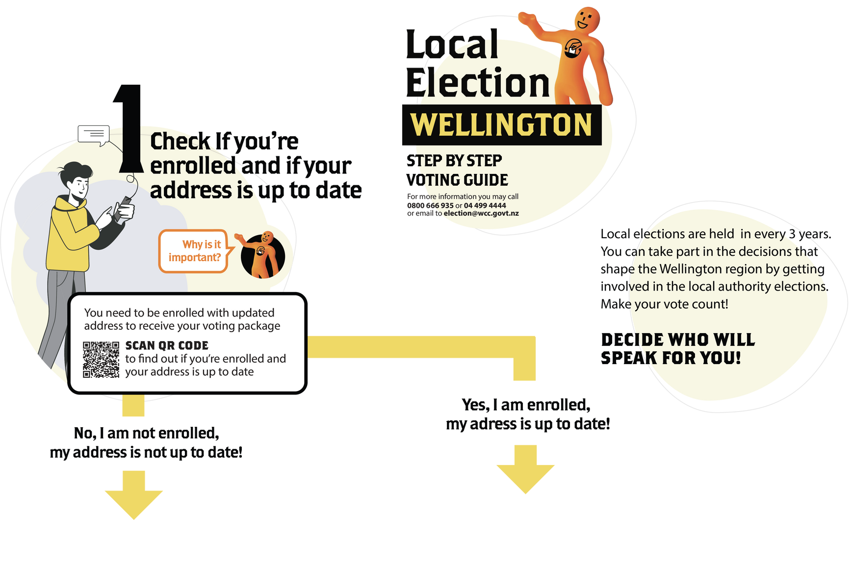
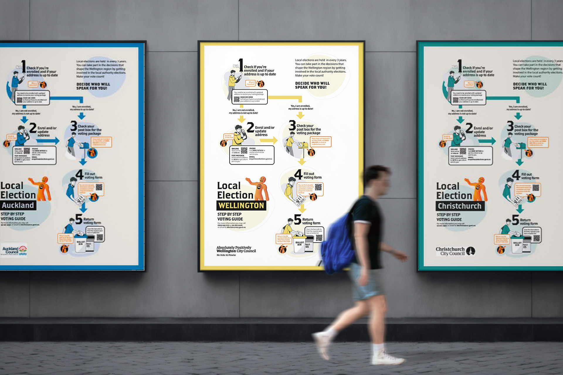
Clear visual guidelines walk voters through the process step by step,
bridging online and offline interaction with a simple QR code.
The tagline "Decide who will speak for you!" nudges voters to make their voice count.
Adaptable colour schemes let councils align the infographic with their own branding and
identity.
Mobile version
Scanning the poster's QR code
opens a scrollable, interactive mobile guide that walks voters through completing their
vote.
Voting location map
The redesigned map clears up confusion
around interaction and iconography.
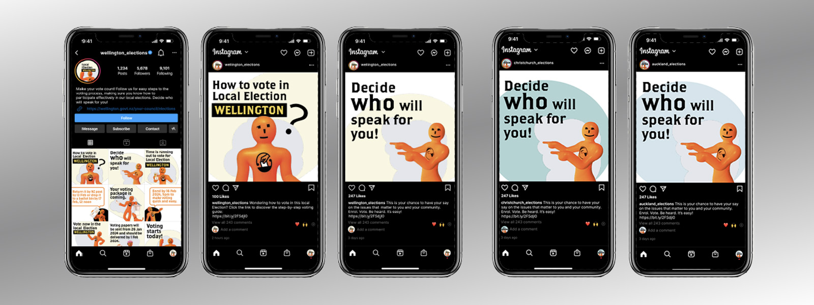
Instagram
The campaign
extended to Instagram, reaching social media users with key dates and essential voting information.
Click on the image to view project in detail
Designing practical learning resources and tools to help staff understand and apply Customer Experience practices.
Exploring how a more coherent design system can improve consistency, usability and scalability across digital experiences.
Creating an editorial experience that brings together information, imagery and storytelling to engage the museum's community.
Creating a consumer-facing campaign that translates Brandt's product proposition into an engaging lifestyle experience.
Designing a visual sales toolkit to communicate membership benefits clearly and support customer conversion.