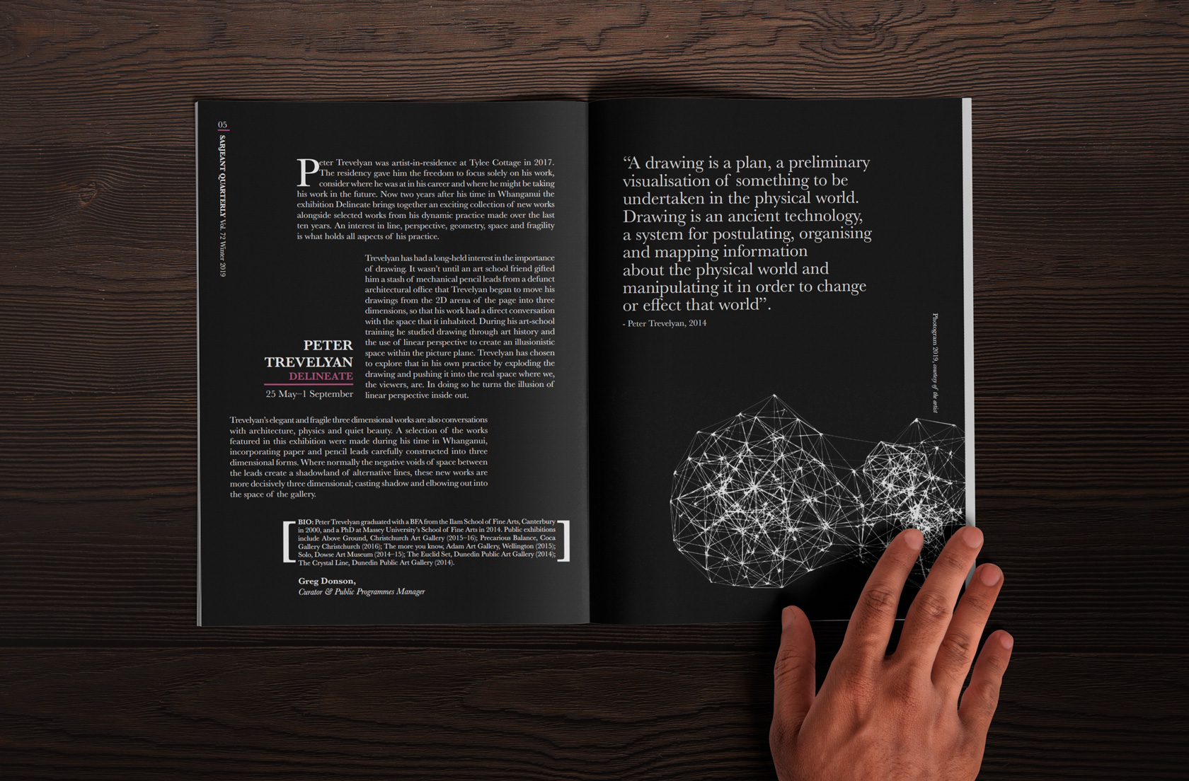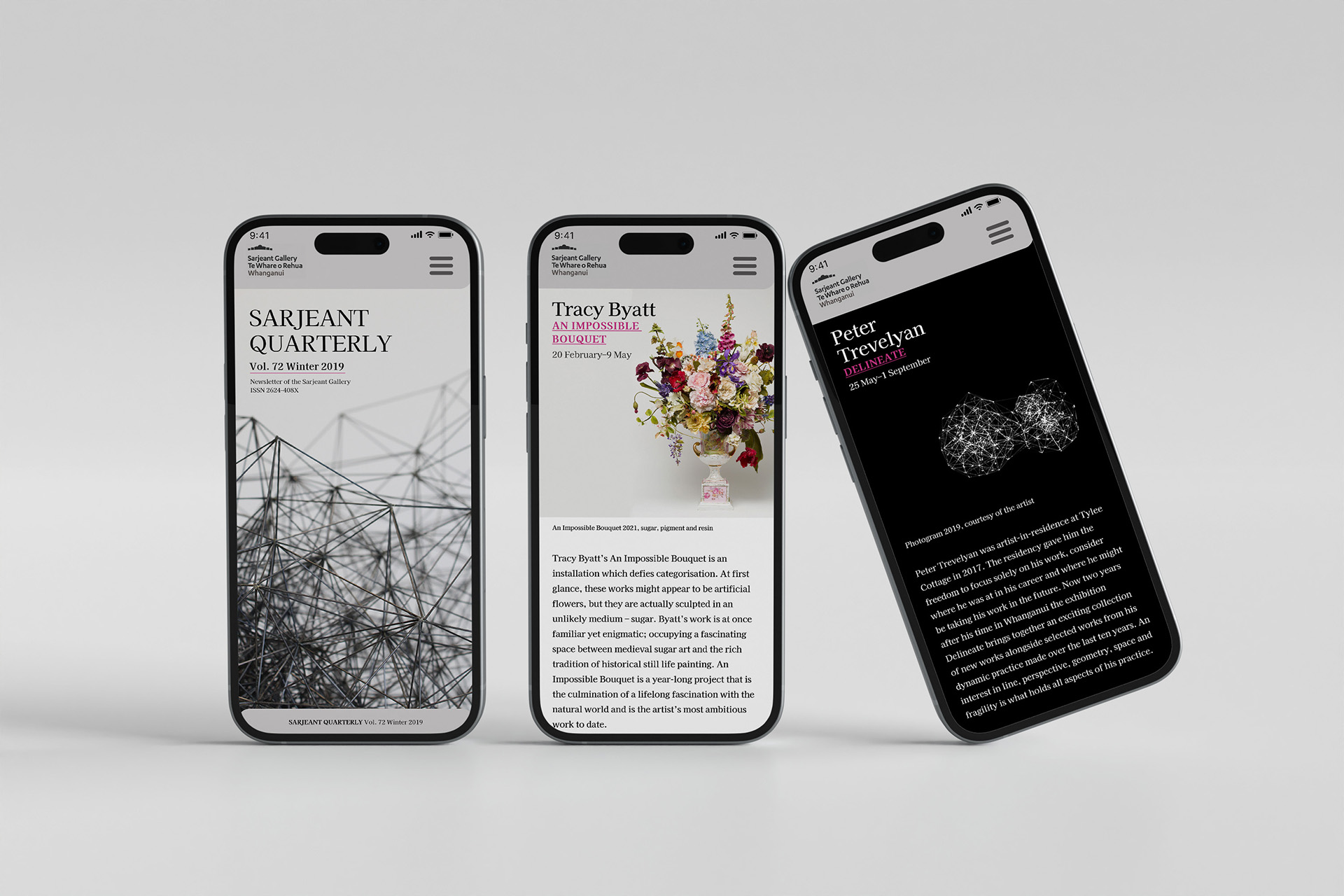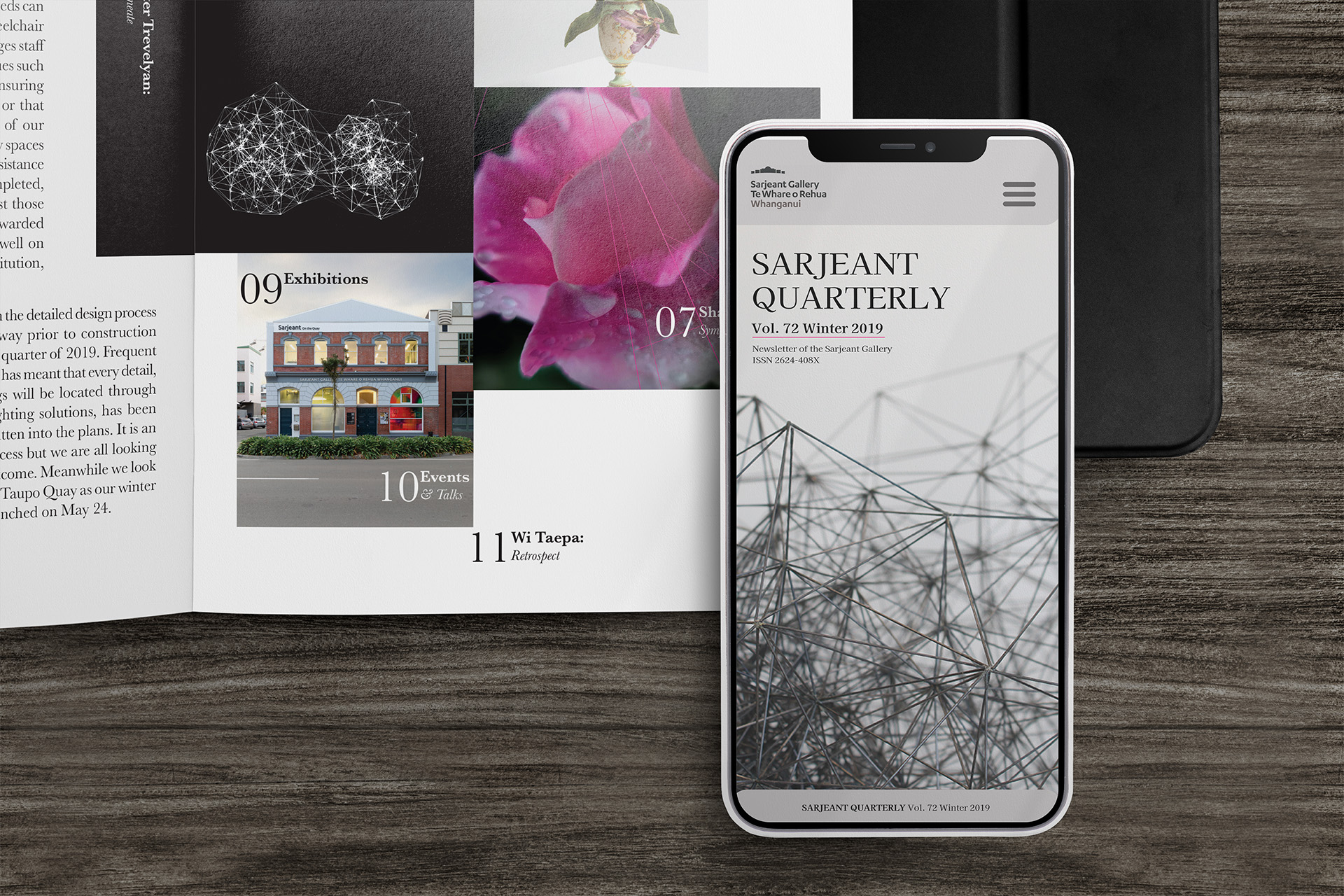
This redesign project centered on reimagining the layout for both print and mobile formats of Sarjeant Quarterly Magazine. Using existing content, the objective was to create a visually cohesive experience across platforms while enhancing usability.
Type Publication and mobile designer
Brand Sarjeant Quarterly
Role Publication and mobile designer
Skills InDesign, Photoshop and Figma

Magazine (Print)
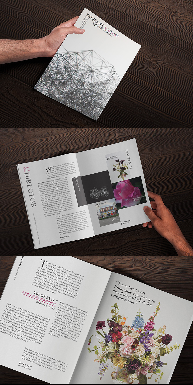
For the print version, I employed a dynamic 5-column flexible grid system to organise paragraph blocks, ensuring clear text flow and hierarchical structure. The design challenges traditional boundaries by arranging text in unconventional ways, introducing varied orientations while maintaining a clean and minimalist aesthetic. A restrained colour palette was chosen, using just one accent color drawn from the hero image, allowing the visuals to stand out without overwhelming the content.

Mobile
For the mobile version, the design has been simplified to a top-down layout to ensure readability. Leveraging digital capabilities, I incorporated subtle animations to add visual interest to each feature page, enhancing user engagement.

Click on the image to view project in detail