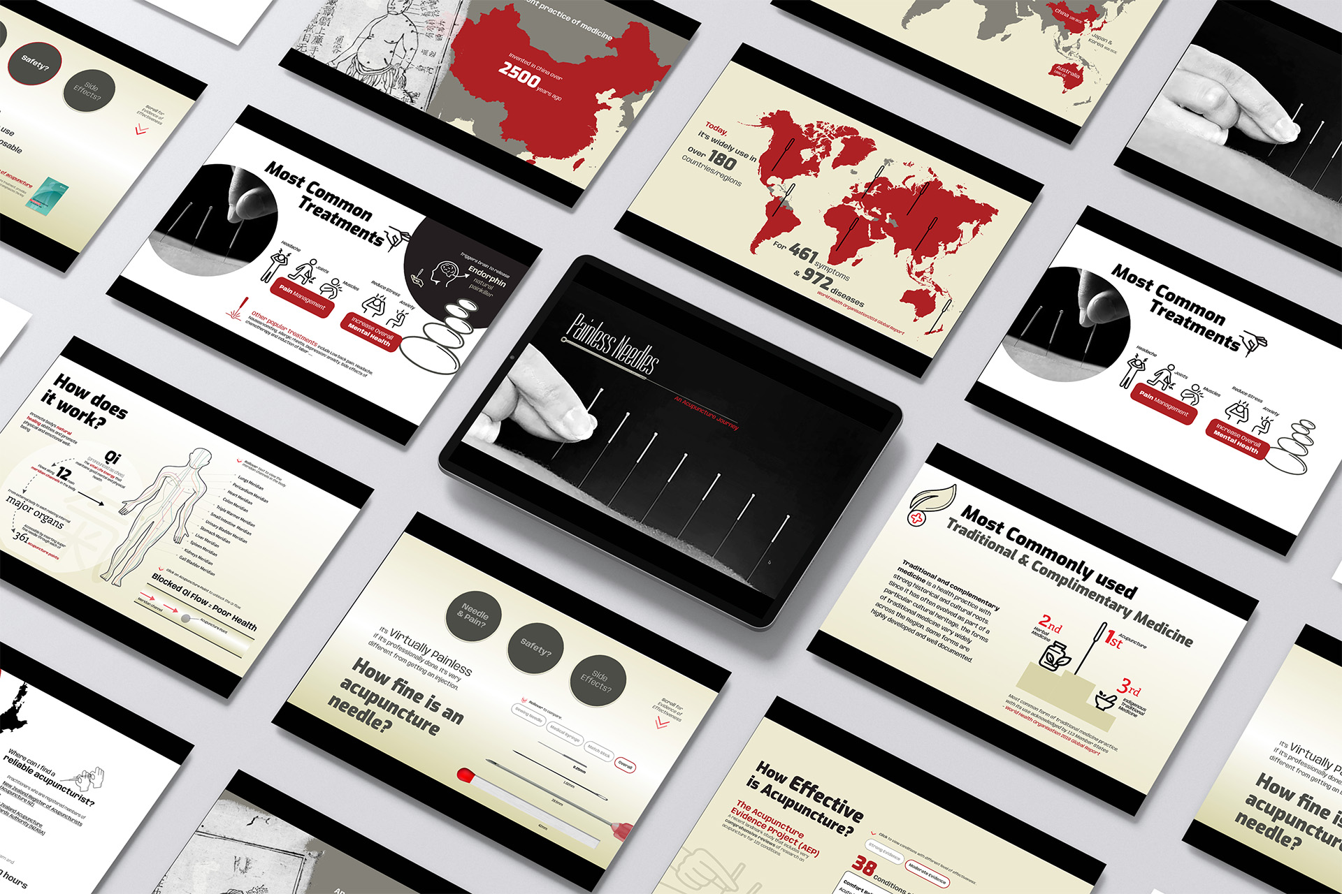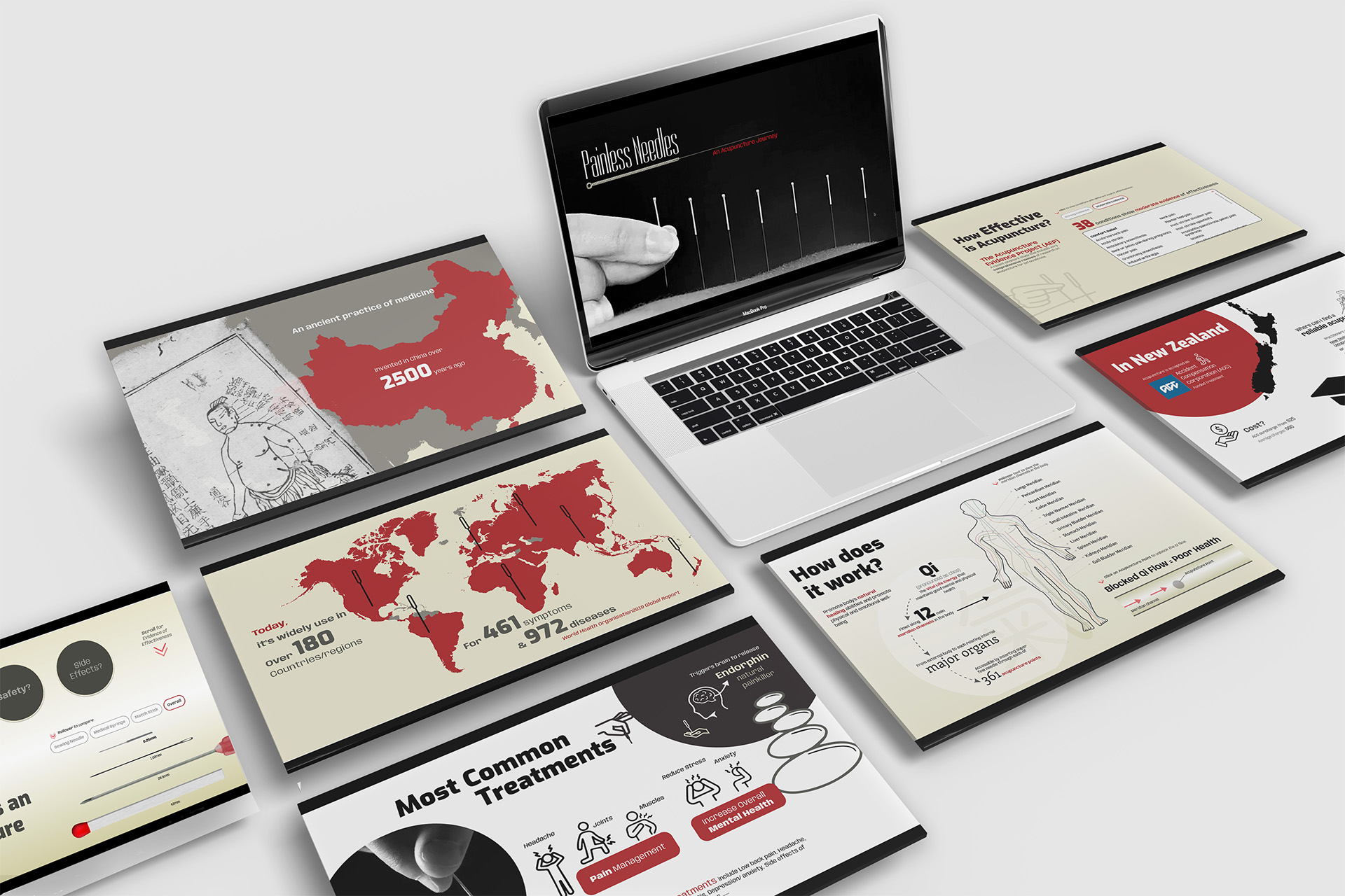
This project focused on designing an interactive infographic that promotes the benefits of acupuncture, inspired by my personal experiences. I aimed to share the potential of acupuncture with a broader audience and dispel misconceptions.
Type Storytelling, Interactive Infographics, Academic
Role UX/UI Designer
Skills Photoshop, Illustrator, Figma, Research, Infomation Architecture, Storytelling

Problem
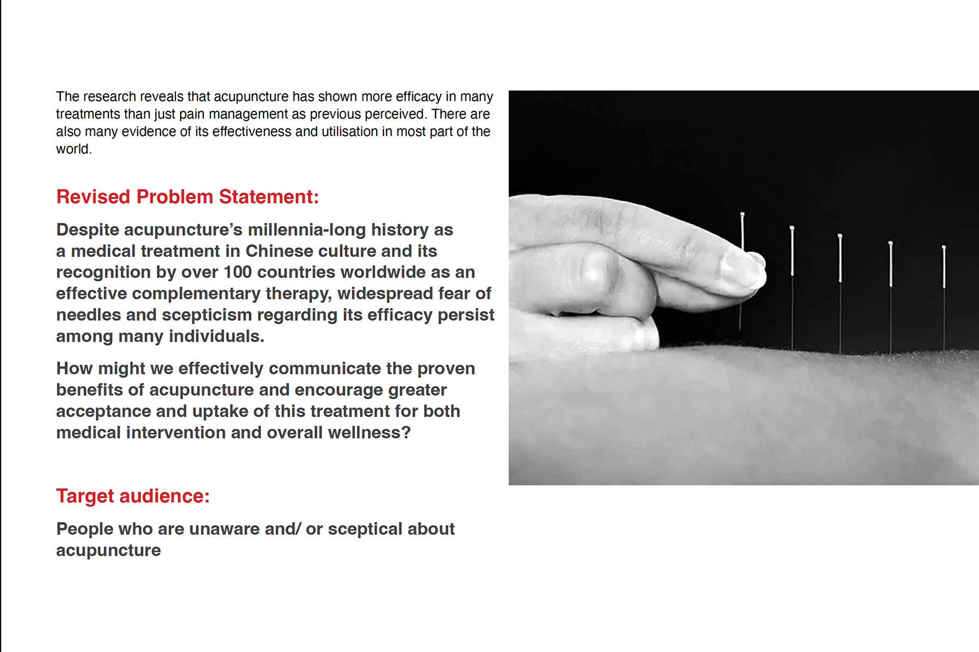
Despite its long-standing history in Chinese medicine, acupuncture still faces skepticism, particularly regarding the use of needles. The project’s goal was to address the common fears and myths surrounding acupuncture, particularly the fear of needles, and present factual, easy-to-understand information that resonates with the audience.

Epiphany
In-depth research into acupuncture's history and treatment methods revealed that, while it is well-known in many countries, it remains less familiar in New Zealand. Moreover, the needles used in acupuncture are much finer than people expect. For those worried about pain, this is a significant relief—thus, the idea of "painless needles" was born.

Process
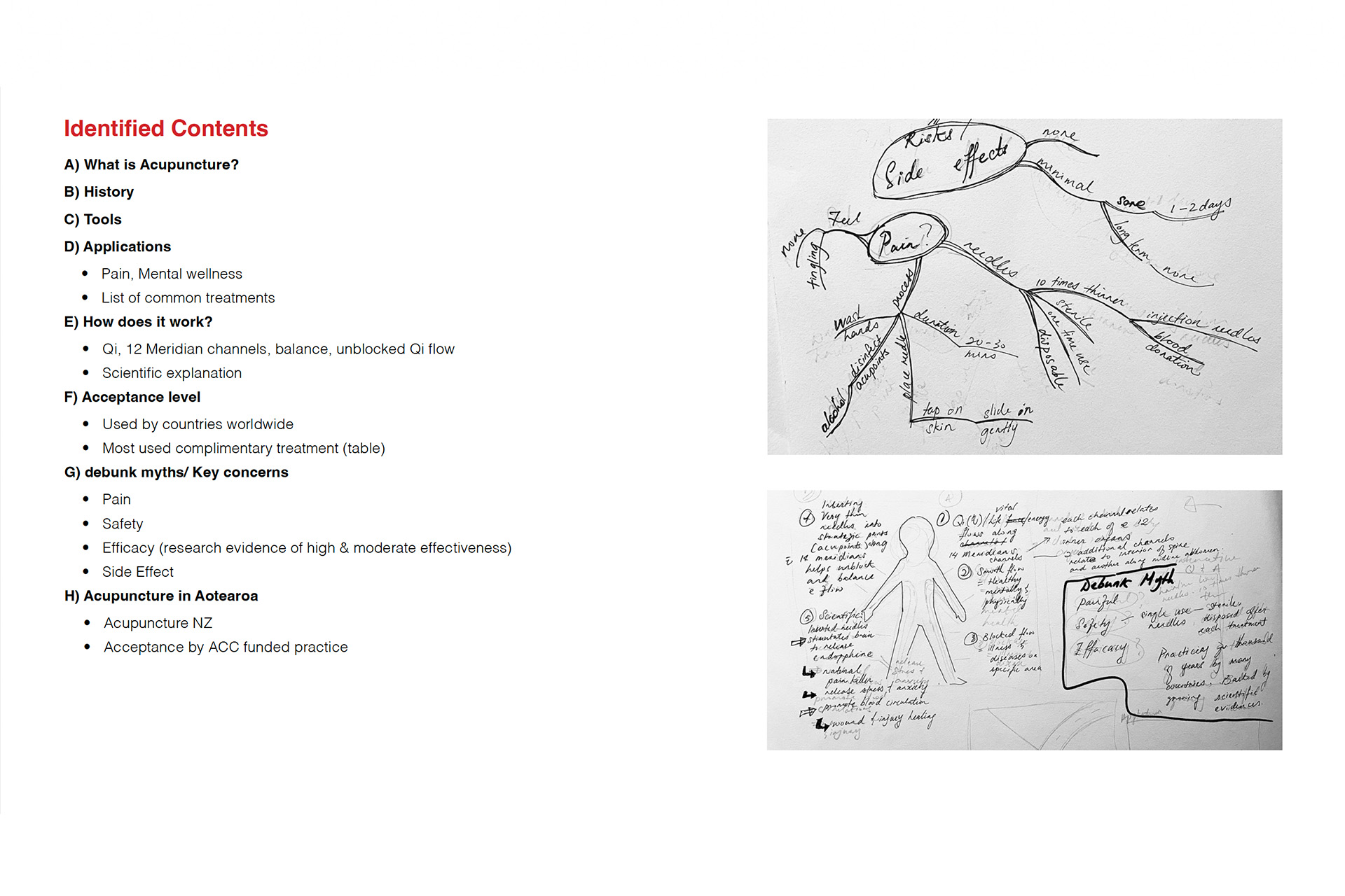
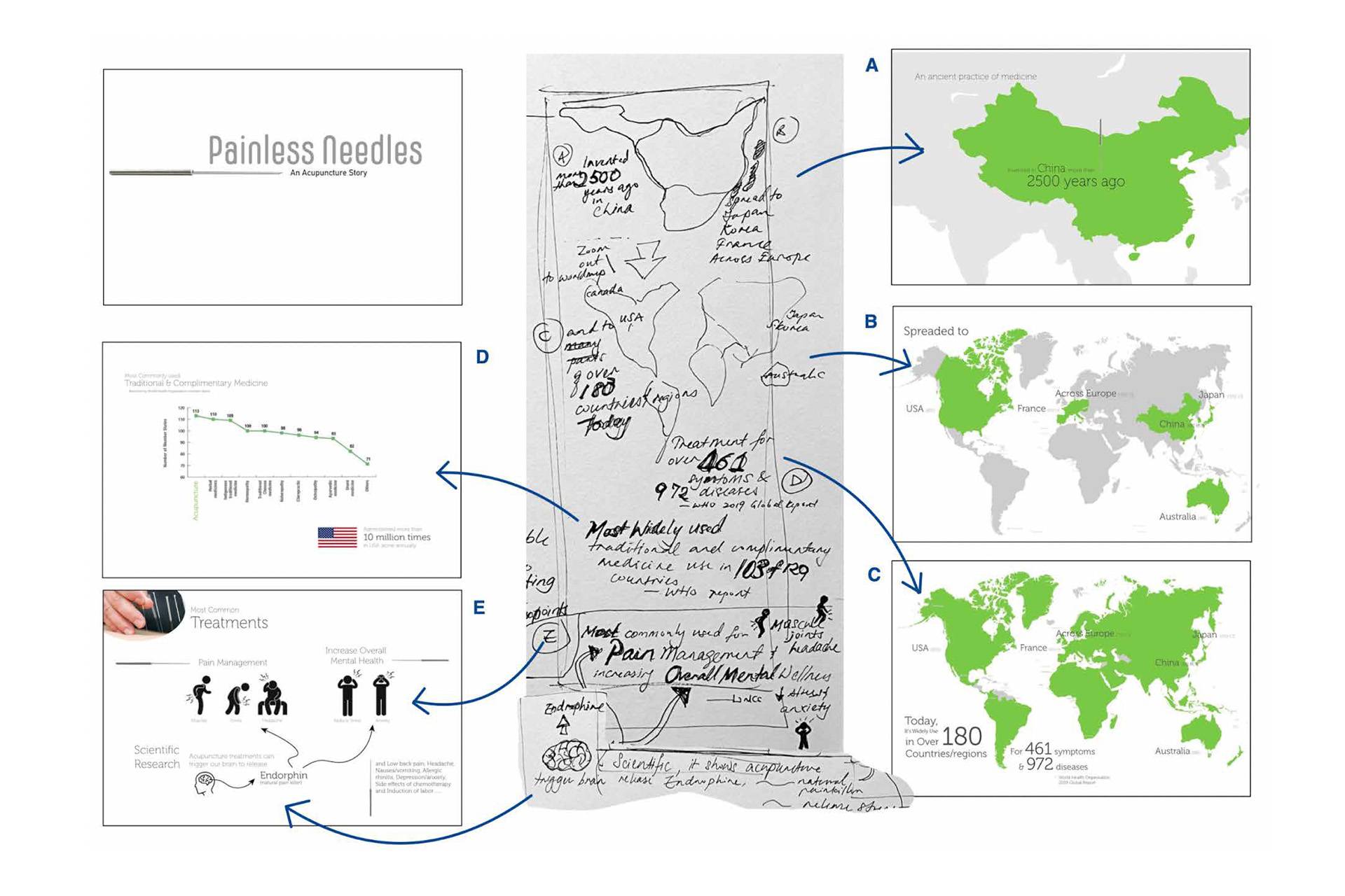
To effectively manage the extensive information, I began by using mind mapping to organise the content, ensuring a logical flow for the narrative. This initial step is rooted in best UX practices for content structuring, enabling clear information hierarchy and intuitive navigation for users.
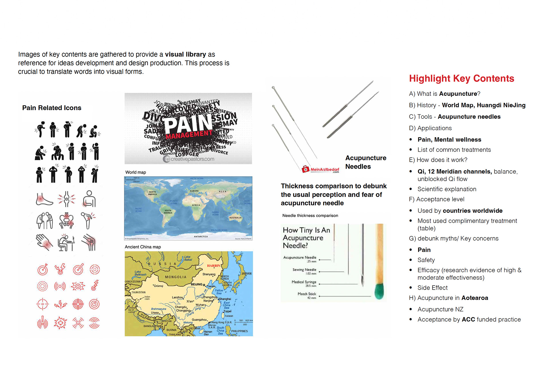
One of the key challenges was the limited availability of acupuncture-related visual elements. To address this, I explored various visual assets that could be integrated into the design while adhering to the principle of content relevance—a core UX consideration. Ensuring that all visuals directly supported the narrative helped maintain focus and user engagement.
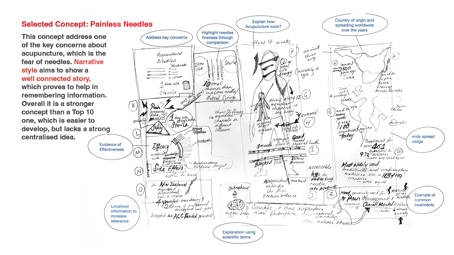
I then developed visual sketches of the narrative based on the selected concept, which served as a foundation for the overall design direction.


With these insights, I created a quick PDF prototype to test the narrative and gather early feedback.

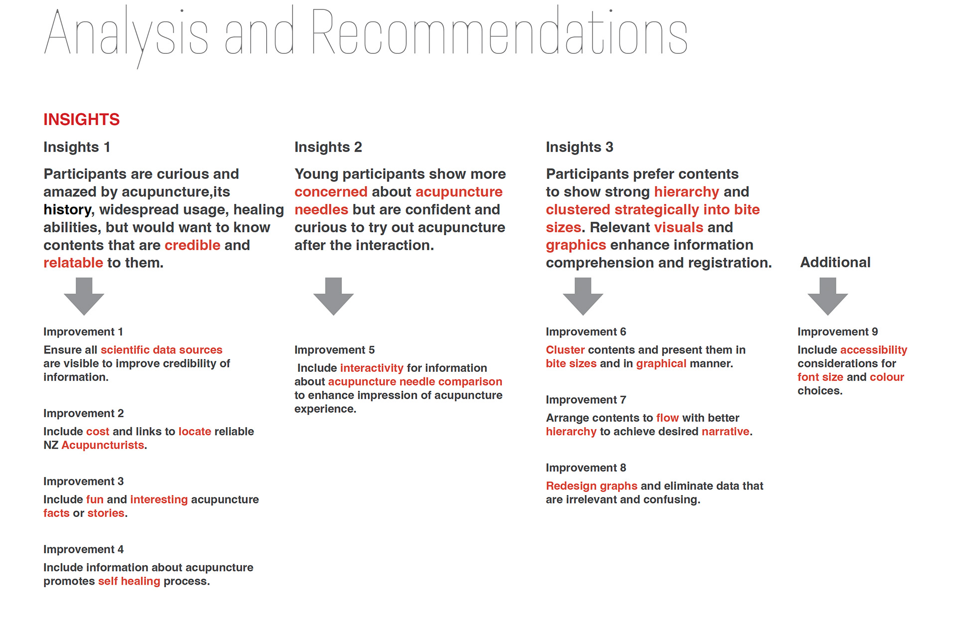
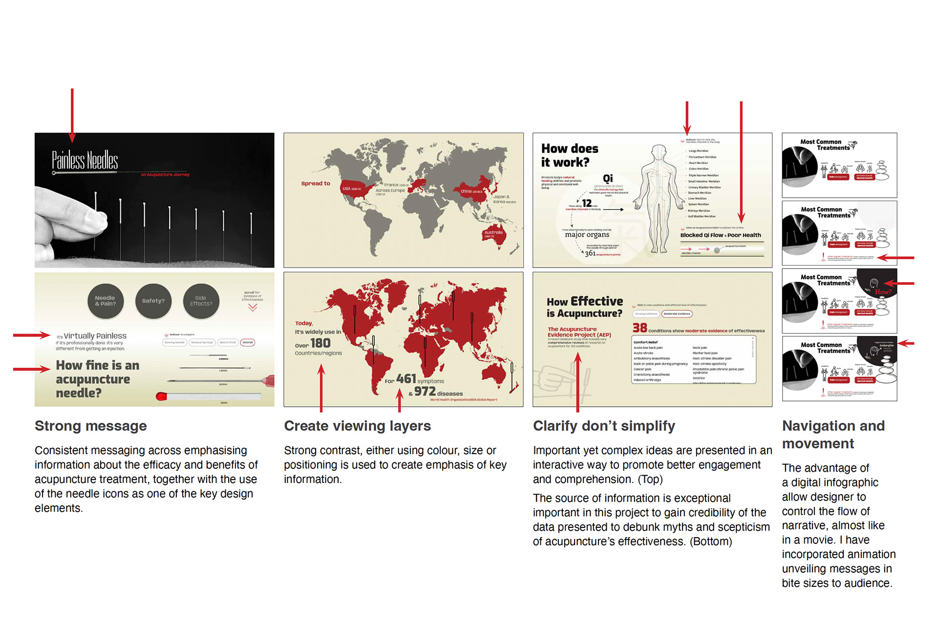
In line with iterative design practices, user testing highlighted the importance of demonstrating factual evidence and using simplified visuals to effectively communicate complex data. This feedback loop was crucial in refining both content and design.

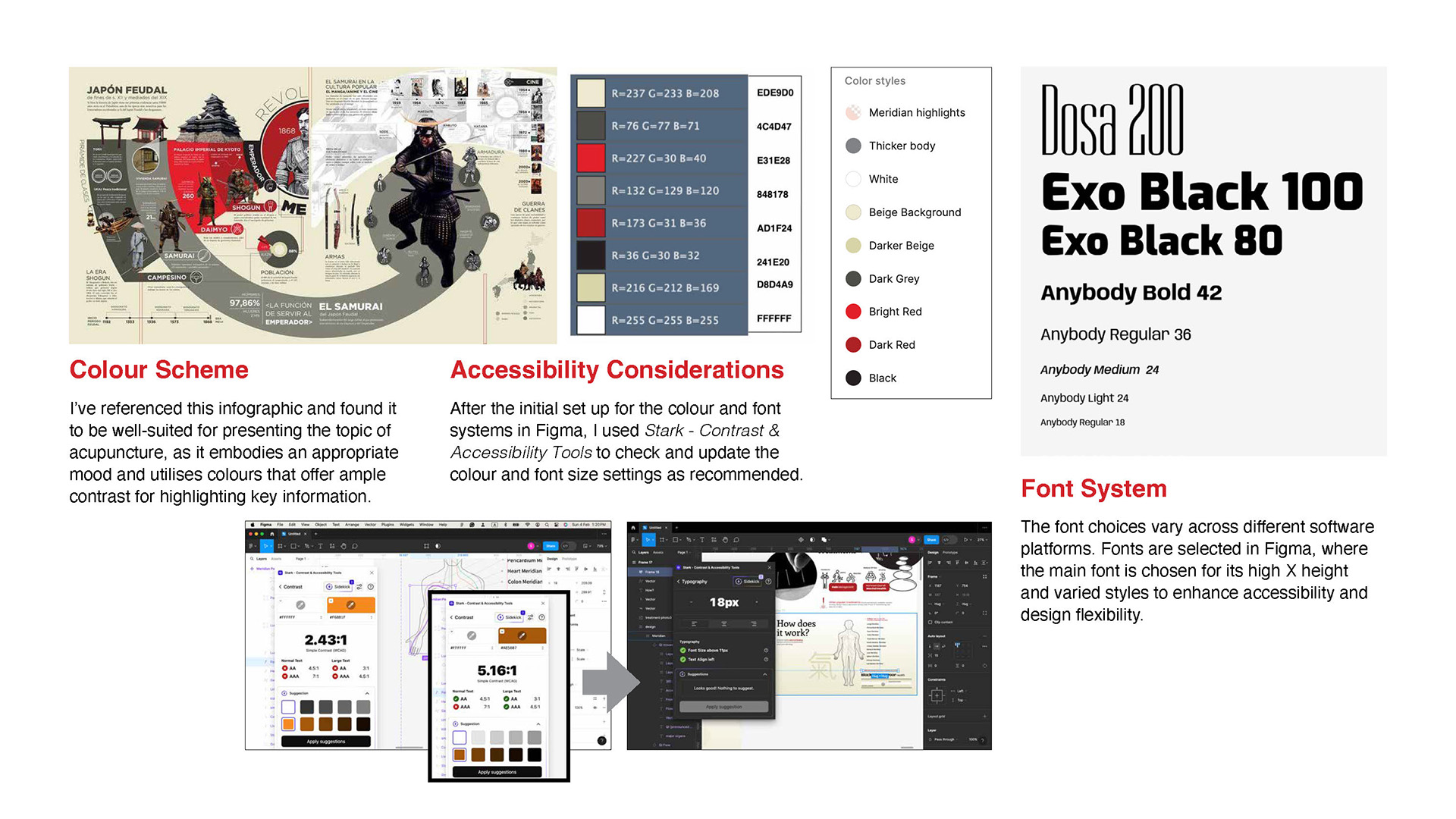
The next phase involved developing the art direction, which included establishing the visual style, color scheme, font system, and ensuring accessibility compliance. Accessibility was a top priority, ensuring that the final design was inclusive and could be easily navigated by a diverse user base. The design choices were thoughtfully crafted to maintain a consistent theme that resonated with acupuncture while considering color contrast, legibility, and responsiveness.
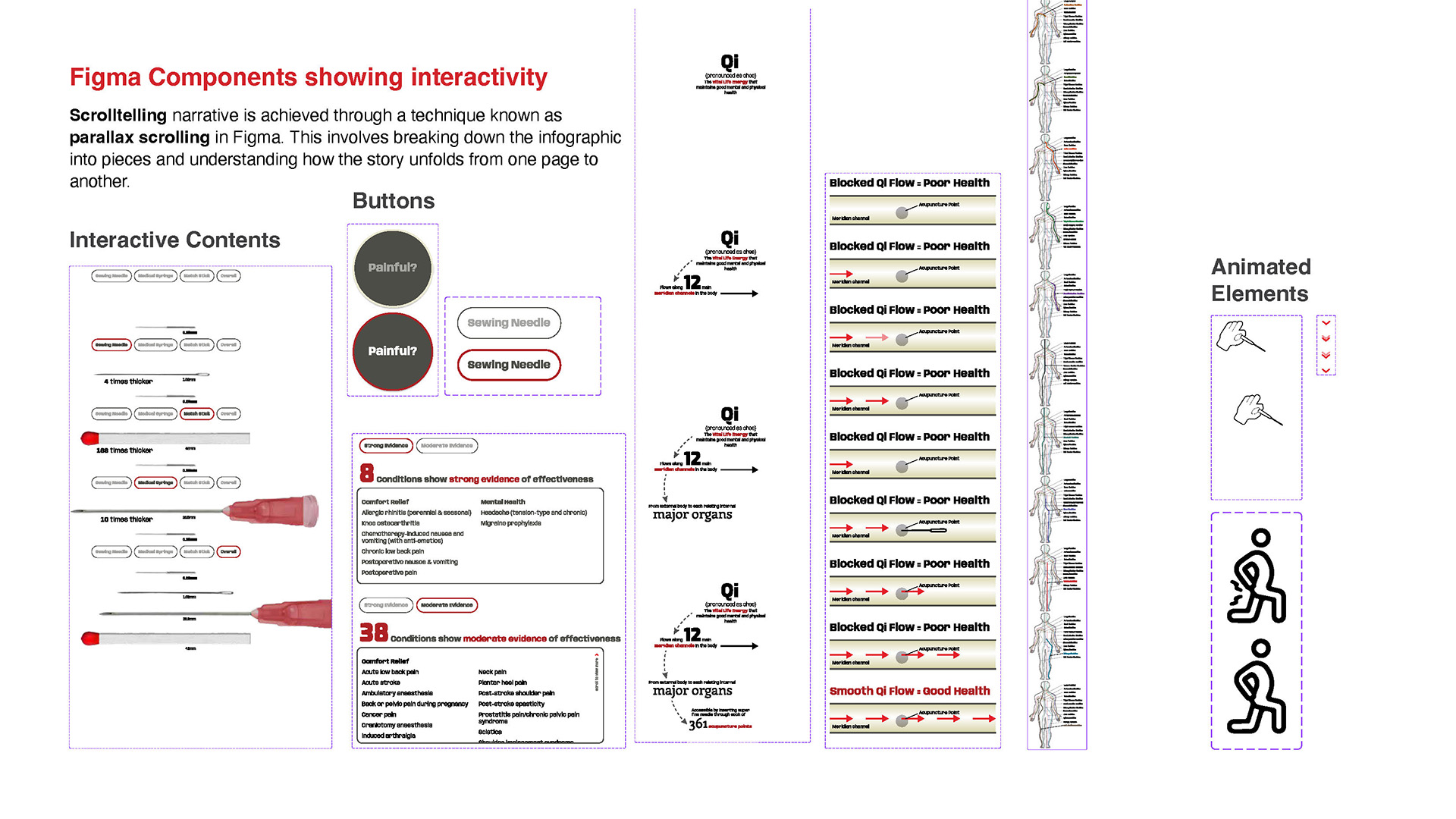
To enhance interactivity and keep users engaged, I implemented techniques such as parallax scrolling and subtle animations. These features, in accordance with progressive disclosure principles, allowed information to be revealed gradually, reducing cognitive load and improving the user’s overall experience.


Result
The final product is an engaging, interactive infographic that debunks myths and builds trust by presenting factual data in a visually compelling, narrative-driven format. Integrating text, images, and graphics, the project provided me with valuable insights into delivering complex information through effective storytelling and enhanced my skills in creating interactive user experiences.

Click on the image to view project in detail